16 January 2023 James Koussertari
The WordPress block editor is a huge improvement to the classic editor and has massive potential. It is constantly evolving and the core team is doing an excellent job at pushing the project forward. I am a huge advocate of the Gutenberg project, so I want to make it clear that the purpose of this article is only to suggest how it can be improved by highlighting areas which I feel need more responsive control. It is not in any way a negative review of the block editor.
So, let’s dive in.
Firstly, I just want to touch on some of the benefits that are mentioned on the Gutenberg website:
Although the block editor is definitely achieving those statements in comparison to the classic editor, I think it could do even more to cement those claims. This is where the lack of responsive controls comes into it.
Without the ability to control styling for different screen sizes within the editor, custom CSS will always be needed, and for non-developers this can be a pain point. Most users will look for a plugin when they are unable to do something with WordPress, which is not a bad thing at all. There are fantastic plugins which add the responsive settings to Gutenberg and we have listed our favourites at the bottom of this article. However, I believe responsive control should be a basic requirement of a page builder and therefore should ideally be baked into Gutenberg core.
Intricate designs are difficult to replicate using just plain Gutenberg. This is where the ACF approach works well because developers can achieve an exact representation of a design by abstracting everything into the theme using PHP and CSS. However, you then lose the amazing editing experience of the block editor. ACF blocks can bridge the gap in this regard, but it’s still no match to the native block editing experience.
For WordPress professionals to be all-in with Gutenberg, they need responsive controls to replicate designs exactly how they have been given to them by the designer. Without responsive control within the editor, developers have to keep fighting core styles with custom CSS and this is not a nice development experience for large complex websites.
When it comes to styling, a lot of developers prefer everything in the editor or everything in the theme. A mixture of both can become a confusing experience, especially later down the line with future changes.
Below I am going to list some of the core blocks where I feel responsive controls would increase possibilities and make core Gutenberg much more powerful.
Currently you can only select the number of columns for desktop and this simply stacks down to a single column on mobile if you toggle “stack on mobile”. Although this does the job, it’s very rudimental. There are times when you may want a section to have 4 columns on desktop and two columns on mobile, as an example. This is a non-negotiable feature in my opinion. You cannot assume that all columns should stack to a single column on mobile.
Sometimes images on desktop need to be replaced with a more suitable image on mobile. This is a different problem to what srcset solves. Sometimes an image needs to be entirely different on mobile too. Yes you could just hide one with CSS and show another, but this gets messy in the editor and you don’t get a true representation of the design anymore. The ability to swap images at different breakpoints would be an amazing feature.
The ability to change the spacer height at different screen sizes would prevent unnecessarily large padding on mobile. It would also just allow much greater design control. This is coming soon though!
Below I list some of the style settings where I feel responsive controls are essential. These settings may be available across multiple blocks and so the responsive controls could be universal.
When using padding or margin settings, these can require adjustments for different breakpoints. A card for example, will usually have larger padding on desktop than on mobile, but not always. Therefore this needs to be controllable inside the editor and not specified just in the CSS as it limits the possibilities.
Plenty of times I prefer to center certain sections of text on mobile but not on desktop or vice versa. Currently text alignment cannot be adjusted for different breakpoints which is unfortunate.
This is more of a rare scenario but it’s totally possible that I may need to change a background or text colour specifically on mobile. This would require custom CSS at the moment whereas I should be able to simply toggle to mobile view and change the colour setting.
Although fluid typography is excellent and works most of the time, there are some rare occasions where the font size needs to be adjusted to fit a specific area on a mobile. The ability to be able to tweak font sizes in the editor in these scenarios would be a nice feature.
The good news is that all of the above challenges have been solved by third party plugins. This is of course part of what makes WordPress great. If you are looking for plugins which add responsive controls (and more) to the Gutenberg editor, check these out:
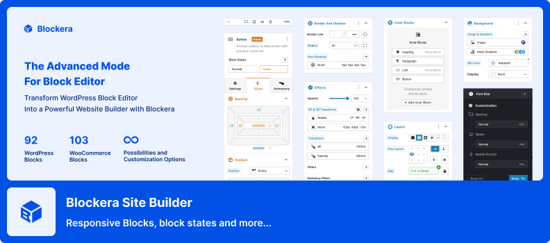
Blockera Site Builder is a feature-packed plugin that fills many of the gaps in the block editor. It introduces responsive breakpoints, block states, and a range of advanced features—while still relying on the core blocks you already know. By not adding tons of new blocks, it reduces bloat and ensures you aren’t locked into the plugin down the road.
The plugin comes with a user-friendly interface and a robust set of block options—think customizable columns, flexible spacing controls, and visually appealing pre-designed sections. You can also fine-tune your layouts for specific devices, giving you greater precision over how your site looks on phones, tablets, and desktops.
One of the standout features is the advanced styling toolkit. You can experiment with different fonts, colors, backgrounds, and animations—all without writing any custom code. Whether you’re building a personal blog or a dynamic e-commerce store, Blockera Site Builder aims to streamline your design process and keep your site looking sharp across all devices.
If you want a plugin that combines ease-of-use with powerful design flexibility, this is a great place to start.
Kadence adds custom blocks and options which extends Gutenberg’s editing capabilities. You can create stunning websites with ease and you don’t need any coding experience. Kadence Blocks is a toolkit which makes the block editor capable of creating highly flexible and responsive content that’s usually only possible through page builder plugins such as Elementor. Simply toggle between screen sizes and make your customisations. Each block is crafted with performance, accessibility, and extensibility in mind.
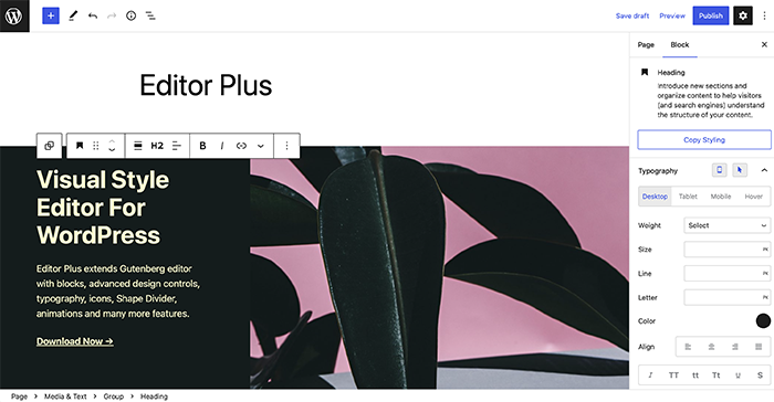
Editor Plus is the ultimate WordPress plugin for enhancing the Gutenberg editor. With Editor Plus, you can design pages faster and better than ever before. The reason this plugin stands out from the rest, is because it adds design and responsive controls to the core blocks. It also includes a custom CSS editor, missing Gutenberg blocks, and the ability to add animations, tweak content typography and insert icons anywhere in the editor. Upgrade your editing game with Editor Plus, and take your website to new heights!
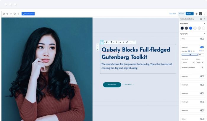
Qubely is a Gutenberg block toolkit with a wide range of custom blocks, predefined sections and starter packs. Qubely opens up unlimited possibilities and provides a great user experience when toggling between different screen sizes. Control the entire responsiveness by defining the breakpoints too. You can even hide blocks on different devices which is very useful.
If you have built a plugin which adds responsive controls to Gutenberg and would like it featured in this article, please let us know. We’d love to list it on our Gutenberg Block Marketplace too!
16 January 2023 James Koussertari