1 May 2023 James Koussertari
useRootPaddingAwareAlignments is an opt-in setting in theme.json which was introduced to solve a common problem with root padding, particularly when using full-width layouts.
The problem was that users were finding it difficult to accommodate both full-width and constrained layouts, without unwanted padding or no padding being applied. Making sure this behaved well on mobile too, added to the problem.
In order to prevent this, users had to manually add left and right padding to all of their top-level container blocks. It wasn’t the end of the world but it was a bit tedious and repetitive.
Users tried to add padding to the root in the theme.json (styles.spacing.padding), but this meant that the blocks could no longer span the full-width completely.
This is where useRootPaddingAwareAlignments came to the rescue. With this setting your full width blocks could break out of constrained layouts while the rest of the blocks had a nice gap on mobile by default.
You can turn on useRootPaddingAwareAlignments in the settings object in theme.json, like so:
{
  "settings": {
    "useRootPaddingAwareAlignments": true,
  }
}
You will also need to add root padding in (styles.spacing.padding), which you will find instructions on further down in this article.
It’s worth experimenting with this opt-in setting to see whether it works for you. It’s not compulsary and there are other methods which you may prefer.
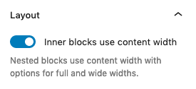
useRootPaddingAwareAlignments is particularly helpful if you regularly constrain your blocks inside of a group block, but somewhere inside that group you want something to break out of that container and span the full-width.
Toggling the option (Inner blocks use content width) on a group block means all child blocks will be aligned to the layout settings defined in theme.json. This is what the setting looks like in the editor:
This is how you define the default sizes of the constrained layout in theme.json:
{
  "settings": {
    "layout": {
      "contentSize": "820px",
      "wideSize": "1200px"
    }
  }
}
You can also add your own custom sizes per group block in the block settings.
In this simplified example below, the grey blocks are set to wide-width and the purple block is set to full-width. Therefore, the grey blocks default to the wideSize of the constrained layout and the purple block is able to break out of the parent’s constrained container using negative margins.
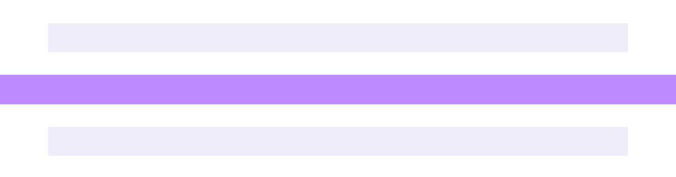
This behaviour is due to having useRootPaddingAwareAlignments set to true. Essentially it’s aware of the root padding and when a block is set to full-width, it adds negative margins to extend past it’s parent. This is what that CSS looks like in the browser’s inspector:
.has-global-padding > .alignfull {
  margin-right: calc(var(--wp--style--root--padding-right) * -1);
  margin-left: calc(var(--wp--style--root--padding-left) * -1);
}
If you want to apply this setting in your block theme, you need to set useRootPaddingAwareAlignments to true in your theme.json.
You also need to define what the left and right padding is in theme.json (styles.spacing.padding). This will give your body some default padding so that constrained content doesn’t touch the edge of the screen.
In the example below, we’ve gone with 2rem as the left and right root padding:
{
  "settings": {
    "useRootPaddingAwareAlignments": true,
  },
  "styles": {
    "spacing": {
      "padding": {
        "top": "0px",
        "bottom": "0px",
        "right": "2rem",
        "left": "2rem"
      }
    }
  }
}
This may solve all your problems and give you the functionality that you need. However, for some people this can also cause confusion and undesirable results. Read on if that’s the case for you.
When using the setup above, it’s worth noting that you can still have issues where content touches the edge of the screen. This tends to happen when you have set the parent group to full-width to break it out of the root padding, however all child blocks will then fill the enitre width on mobile. It seems counter-intuitive that this happens and can leave you confused. The only way to solve this is to add the padding back in manually to that full-width group block.
If you find this happens for you quite often and it becomes irritating, it may be worth simply turning off useRootPaddingAwareAlignments, as your unique design requirements may be better suited to a different approach.
If you turn off useRootPaddingAwareAlignments, you won’t be able to add root padding to theme.json anymore without messing up the full-width alignment. There are workarounds to this below.
Read on for alternative ways of applying container padding in block themes. They are not necessarily better, just different and perhaps work better with your specific block structure.
If you’re struggling with useRootPaddingAwareAlignments and can’t seem to get it working the way you’d hoped, there are others ways which are arguably more foolproof.
This first approach ensures that however your blocks are aligned, nested or constrained, they will not get any negative margins being applied automatically.
To do this, you can simply add custom CSS which targets top-level container blocks, to apply left and right padding globally.
.entry-content > .wp-block-group,
.entry-content > .wp-block-columns,
.entry-content > .wp-block-cover {
  padding-left: 2rem;
  padding-right: 2rem;
}
The “>” in the CSS above ensures the blocks are direct descendants of the entry-content container so that it isn’t applied to nested blocks.
You could add other common container blocks into this CSS if you need to, or even use a “*” to target all direct descendants.
This padding can be overridden per block in the block settings sidebar, if necessary.
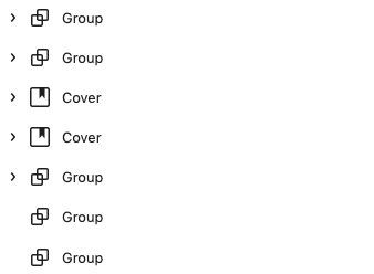
If you use this approach, you must wrap each top-level section in one of those container blocks, like this:
If you don’t like the idea of useRootPaddingAwareAlignments, or adding custom CSS to your theme, you could go back to the default behaviour, of manually applying the padding yourself to your top-level container blocks, within the editor.
This is how you would do this in the block’s padding styles.
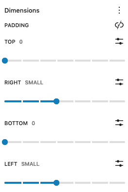
It’s technically the same as applying it globally with CSS, but this way the padding is visible in the editor for everyone to see. Some people prefer this for transparency so that nothing is hidden away in CSS.
It’s worth pointing out this is obviously a more manual process which would require you to add this padding every time you add a top-level parent block. However, you do have better visibility of what’s going on inside the editor this way.
There’s no right or wrong approach to tackle the problem of root padding and it purely depends on your preference and design requirements.
We would strongly recommend experimenting with useRootPaddingAwareAlignments to fully understand how it works and what’s best for you.
If you have any feedback or further questions around this topic, send us a message or tweet us.
1 May 2023 James Koussertari