12 June 2024 James Koussertari
Fluid typography in WordPress Block Themes is considered standard practice nowadays, so it’s something you can’t afford to ignore as a web developer or even as a website editor.
In this short tutorial, we will look at what fluid typography is, how it’s applied and how it fits into blocks themes.
Fluid typography is a design approach employed in web development that allows text size to adapt dynamically to the viewport size of the user’s device. Rather than relying on fixed font sizes, relative units enable text elements to scale proportionally, ensuring an optimal reading experience across various devices and screen dimensions.
The ultimate aim of fluid typography is to improve readability and usability, delivering a seamless user experience to visitors accessing the website from a variety of devices, including desktops, laptops, tablets and smartphones. By accommodating the available space, fluid typography effectively avoids issues such as excessively large or small fonts, awkward line breaks, and unnecessary scrolling.
Web designers and developers utilise relative units like vw, vh, percentages, ems, or rems instead of fixed pixel sizes. This is the foundation of fluid typography. Through setting font sizes relative to the parent or root element, the text seamlessly scales up or down with changes in the viewport. Let’s look at each relative unit in a bit more detail:
em: The em unit represents the computed font size of the element, based on its parent’s font size. For example, if you set font-size: 16px; on the parent element, and font-size: 1.5em; on a child element, the child’s font size will be 1.5 times the parent’s font size (16px * 1.5 = 24px).
rem: The rem unit stands for “root em,” and it represents the computed font size of the root (HTML) element. Unlike em, rem is not affected by the font size of parent elements. This makes it especially useful for creating consistent and scalable typography throughout the entire document.
vw and vh: These units represent a percentage of the viewport’s width (vw) or height (vh). For example, 1vw is equal to 1% of the viewport width, while 3vh is equal to 3% of the viewport height. These units are helpful for creating responsive layouts that adjust based on the device’s screen size.
%: The percentage unit is used to define values relative to the parent element’s property. For instance, width: 50%; on a child element means it will occupy 50% of the width of its parent.
Relative units are versatile and play a significant role in responsive design. By using these units, you can ensure that elements, fonts, and layout proportions adjust seamlessly to different screen sizes and devices.
To use CSS clamp() for fluid typography, you can set a range of acceptable font sizes based on the viewport width. The clamp() function takes three parameters: the minimum font size, the preferred font size and the maximum font size. The browser will then automatically choose the appropriate font size within this range based on the available space.
Here’s how you can implement fluid typography using clamp() in CSS:
body {
  font-size: clamp(2rem, 5vw, 3rem);
}
The font size will be set to 2rem on small viewports (where the viewport width is less than or equal to 320px), and it will scale up as the viewport width increases. At the breakpoint, the font size will be 5% of the viewport width (5vw). Finally, the font size will not exceed 3rem, ensuring it remains readable on larger screens.
You can adjust the values in
clamp()to fit your design and typography preferences.
Clamp() solves many responsive challenges right out of the box and is really easy to implement using theme.json.
Firstly, you can simply use CSS clamp() within settings.typography.fontSizes. Something like this:
"settings": {
  "typography": {
    "fontSizes": [
      {
        "name": "Small",
        "slug": "small",
        "size": "clamp(2rem, 4vw, 3rem)"
      }
      {
        "name": "Medium",
        "slug": "medium",
        "size": "clamp(3rem, 6vw, 4rem)"
      }
      {
        "name": "Large",
        "slug": "large",
        "size": "clamp(4rem, 8vw, 5rem)"
      }
    ]
  }
}
In this example, we’re adding three custom font sizes that will now appear in the block editor styles tab for each block that supports typography settings. We must define the name of the font size, the slug and the size. The size property accepts any valid CSS unit, so we could use px, em, rem etc. However, it also accepts clamp(), which is obviously a better choice when trying to create fluid typography.
Instead of manually adding clamp(), you could use the new fluid feature that was made available in 6.1. This essentially uses clamp() under the hood but it has some extra benefits.
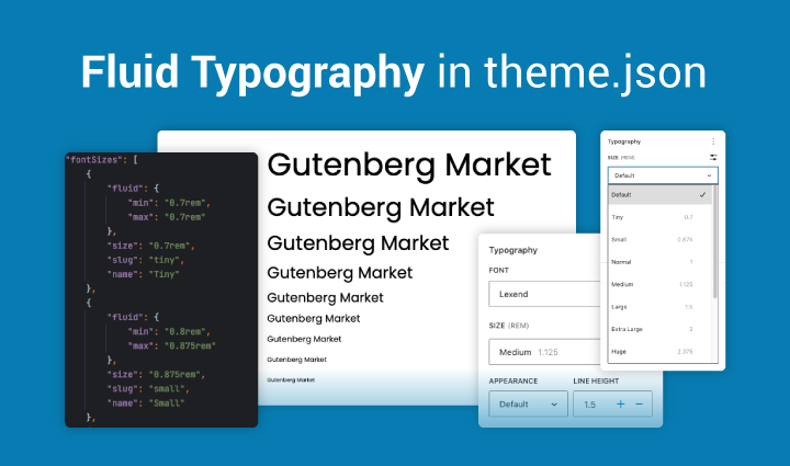
Fluid typography is disabled by default and you need to enable it by setting “fluid": true under settings.typography.
Here is how you would use this in your theme.json file:
"settings": {
  "typography": {
    "fluid": true,
    "fontSizes": [
      {
        "name": "Medium",
        "slug": "medium",
        "size": "2.375rem",
        "fluidSize": {
          "min": "1.875rem",
          "max": "2.375rem"
        }
      },
      {
        "name": "Large",
        "slug": "large",
        "size": "3rem",
        "fluidSize": {
          "min": "2.125rem",
          "max": "3rem"
        }
      }

    ]
  }
}
The size is the “preferred value”
The min size is used below 768px
The max size is used above 1600px
The default scale factor is 1
The obvious advantage is that it’s the standard method of applying fluid typography within a block theme and therefore you are adhering to the WordPress way of doing things.
Another advantage is that as soon as fluid is enabled, WordPress adds clamp() to the default font sizes:
--wp--preset--font-size--small: clamp(9.75px, 0.609375rem + ((1vw - 7.68px) * 1.172), 19.5px);

--wp--preset--font-size--medium: clamp(15px, 0.9375rem + ((1vw - 7.68px) * 1.803), 30px);

--wp--preset--font-size--large: clamp(27px, 1.6875rem + ((1vw - 7.68px) * 3.245), 54px);

--wp--preset--font-size--x-large: clamp(31.5px, 1.96875rem + ((1vw - 7.68px) * 3.786), 63px);
It also converts custom font sizes to clamp(), whether defined in theme.json or the editor:
.wp-block-post-date{font-size: clamp(10.5px, 0.65625rem + ((1vw - 7.68px) * 1.262), 21px); }

h1{font-size: clamp(3rem, 3rem + ((1vw - 0.48rem) * 5.769), 6rem); }

body{font-size: clamp(12px, 0.75rem + ((1vw - 7.68px) * 1.442), 24px); }
It’s also worth mentioning that you can mix fluid and regular font sizes by setting fluid to false. You can also just put the size without the fluid settings and WordPress will automatically convert it to a clamp() function.
"settings": {
  "typography": {
    “fluid”: true,
    "fontSizes": [
      {
        "name": "Small",
        "slug": "small",
        "size": "1rem"
      }
      {
        "name": "Medium",
        "slug": "medium",
        "size": "2.375rem",
        "fluidSize": {
          "min": "1.875rem",
          "max": "2.375rem"
        }
      },
      {
        "name": "Large",
        "slug": "large",
        "size": "3rem",
        "fluid”: false
      }
    ]
  }
}
This would convert to this CSS:
--wp--preset--font-size--small: clamp(0.875rem, 0.875rem + ((1vw - 0.48rem) * 0.24), 1rem);

--wp--preset--font-size--medium: clamp(1.875rem, 1.875rem + ((1vw - 0.48rem) * 0.962), 2.375rem);

--wp--preset--font-size--large: 3rem;As you now have a full picture of what fluid typography is and how it can be implemented within a WordPress block theme, I hope you can see the benefits and advantages to using it.
If this is a new concept for you, it may take some time for it all to sink in. The best way for that to happen is to get stuck in and start experimenting with it.
As always, happy coding 🙂
12 June 2024 James Koussertari