29 August 2024 James Koussertari
This guide is currently in line with version 6.6. Updated August 2024.
If you want to learn how to build production-ready WordPress Block Themes, this article is for you. It’s important to point out that this isn’t a tutorial per se. Instead, it collates the best resources already available for learning how to build Block Themes.
We will also be filling in some of the gaps and offering our own insights. In addition, this guide will highlight some of the limitations of block themes, recommend useful plugins and provide golden nuggets of information.
To follow this guide effectively, you need at least WordPress v6.2 installed, but preferably v6.6+. Some features mentioned in this guide will only be available in v6.6+, which was the latest version of WordPress at the time of updating this guide.
Before we get into the juicy stuff, we’ll first go over some fundamentals, in case you’re not familiar with what block themes are and the terminology around them. If you already have a good grasp on the fundamentals, you can skip ahead.
Block Themes, also known as FSE themes, are revolutionising the way in which we can build websites in WordPress. They are specifically created to work seamlessly with the Block Editor and Site Editor, enabling Full Site Editing features.
Block Themes reduce the need for PHP code and help remove barriers to entry. This opens up WordPress and its features to more people. Developers and designers also benefit from this new workflow, allowing them to focus more on creating great content and less on writing complex and often repetitive code.
Block themes usually provide pre-designed patterns and custom block styles, making it easier for users to create visually engaging content in less time.
This is not the focus of this guide, however we feel it’s important to know that you don’t have to commit to going all in on Block Themes straight away. You can adopt specific features of Full Site Editing into your classic theme, essentially turning it into a hybrid theme. We’re not saying this is the best approach, however, it can help ease you into FSE more gradually. That said, going Hybrid could also make things more complicated if you’re not a very experienced WordPress developer, so bear that in mind when making a decision.
If you want to learn more about the different types of themes available in 2023, read this article, where we break it down for you.
The WordPress Site Editor, introduced in version 5.9, enables you to create an entire website, from the header to the footer, using blocks. It also provides greater control over the appearance of your site, such as changing colour palettes, spacing, font sizes and much more.
To use the Site editor, you must first install and activate a Block Theme on your website. This may be a theme you have built or simply downloaded from the theme directory.
Read the official documentation on the Site editor.
Full Site Editing (FSE) allows users to customise the design and layout of their entire website in the Site Editor, without having to write any PHP code. With FSE, users can modify elements such as the header, footer, post templates, archive pages, and other areas that were previously restricted to code based editing.
Going forward, Full Site Editing describes the overall experience of using the Block and Site Editor, while a Block Theme is what sets up the default styles, patterns, blocks, constraints and demo content.
The Gutenberg Block Editor, introduced in WordPress version 5.0, is a visual page and post editor that allows users to create and edit content using blocks. Each block represents a specific type of content, such as text, images, videos, buttons, etc. The blocks can be easily arranged, reordered, and customised to achieve the desired layout.
The Block Editor provides a more intuitive and user-friendly way of creating content compared to the previous classic editor, which relied on HTML and shortcodes. With the Block Editor, users can create custom post and page layouts with ease and flexibility, without the need for coding knowledge.
Read more about the benefits of the Block Editor.
WordPress blocks are modular content elements that can be used to build pages and posts. They offer a great deal of flexibility and can be used to create complex layouts with ease. Additionally, blocks are responsive, which means they’ll look great on any device.
There are a wide variety of blocks available, including text blocks, image blocks, video blocks, quote blocks, and so much more.
One of the best things about blocks is that they can be mixed and matched to create unique content. For example, you could use an image block followed by a text block to create an eye-catching header for your blog post. Or, you could use a video block followed by a quote block to create an engaging testimonial section on your website. The possibilities are endless!
We have compiled a comprehensive list of core blocks.
In order to run an installation of WordPress, you’ll need either a local development environment or web hosting platform.
The focus of this guide is not how to set up a development environment or hosting platform. Nevertheless, here are some popular tools you can research and look into if you need somewhere to host your WordPress installation:
You will need WordPress v6.2 or above installed and connected to a database in order to continue with this guide. This is not something covered in this article but you can research this on your own and come back when you are up and running.
You can find some great tutorials on YouTube which will walk you through the process. Be sure to follow a tutorial specific to the development environment you’ve chosen above.
To be able to build custom WordPress Block Themes from scratch, it will really help if you know HTML, CSS and basic PHP. If you’re reading this guide, I’ll assume you already have this knowledge. If not, head over to YouTube, Udemy, Codecademy or W3Schools and start learning.
That’s not to say you can’t continue with this guide without knowing code, you certainly can and that’s what makes Full Site Editing so fantastic and accessible to everyone. However, it will help you greatly if you do have some basic coding skills.
Now you have the basics covered, let’s dive into what you need to know in order to start building your first Block Theme.
It’s important to mention that you can take two slightly different routes when building a Block Theme. The route you take is up to you and will determine how much code you want to write or learn.
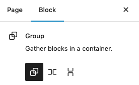
The first route is a no-code option which uses a plugin called Create Block Theme. This plugin essentially helps you to build a Block Theme without needing to understand the mechanics of Block Themes, including the file structure, code and font embedding etc.
This route may give you all the tools you need to build a perfectly suited Block Theme for yourself or your client. Full Site Editing can truly be a no-code option if you don’t need to make any advanced customisations to your theme.
This approach can be a great starting point for developers too, as it helps you get the boilerplate code setup and your fonts embedded etc.
There are some great video tutorials on the official WordPress YouTube channel for using the Create Block Theme plugin:
In order to take this route, it would be advantageous if you have experience building WordPress Themes the “classic way”, so you understand the basic concepts of theme development. A basic understanding of HTML and CSS would also be beneficial.
JavaScript is only necessary for advanced functionality and isn’t something we will go into in this guide.
You may also need to have a basic understanding of JSON, which is a lightweight format for storing and transporting data. There are plenty of tutorials and resources available online to learn JSON or to give yourself a refresher.
Once you have WordPress installed and running, head over to Appearance > Themes, and check which theme is installed. If you have the default Twenty Twenty-Three theme installed, you will have Full Site Editing enabled, since it is a Block Theme.
To enable the Site Editor in your own custom theme, the minimum required files are style.css and an index.html file placed inside a folder called templates.
When you have a Block Theme installed and activated, you will see the Editor under Appearance.
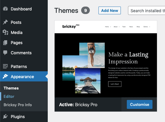
In the screenshot above, I have the Block Theme Bricksy Pro installed and activated.
As shown above, the Site Editor can be found under the Appearance tab. If you click on the Editor link, you will be taken to the Site Editor.
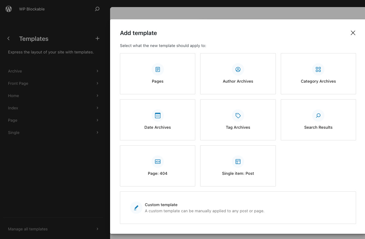
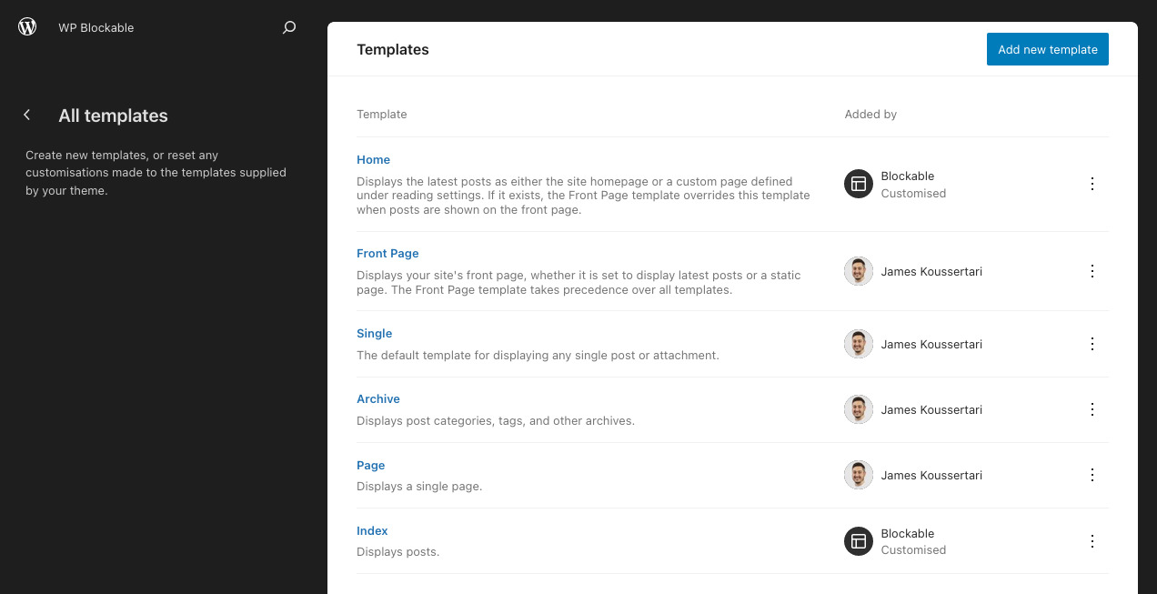
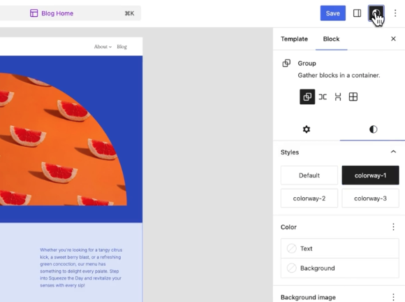
Currently in v6.4 and above, within the Site Editor, there are 5 main sections, Navigation, Styles, Pages, Templates & Patterns.
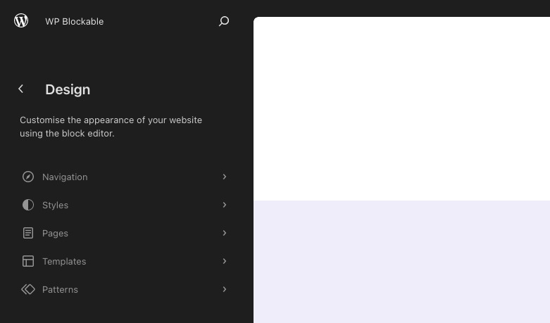
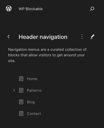
Within this screen you can edit your block menus that may be being used within multiple templates and patterns. This single location makes it easier to find the menu you want to edit.
Here you can adjust the styles of your block theme without writing any code, unless you want to. You can adjust global styles and also block specific styles. You can also write custom CSS if you wish.
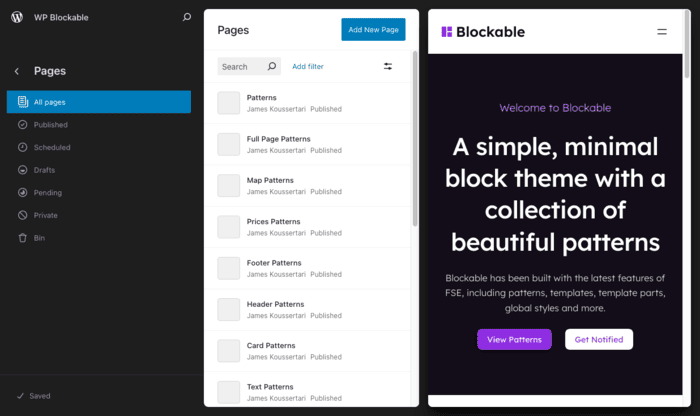
The pages screen is essentially the same as the classic interface, except that it provides the convenience of not having the leave the Site Editor.
This is where you can manage and edit the templates for your website. This has traditionally been something that could only be done with PHP templates within the theme code.
This is where you can manage, edit and create Patterns. You then use these patterns within your templates in the Site Editor for rapid page creation.
If you want to create your own Block Theme from scratch, here is a typical Block Theme structure:
assets (dir)
patterns (dir)
- fonts (dir)
parts (dir)
- footer.html
- header.html
styles (dir)
- blue.json
- dark.json
templates (dir)
- index.html
functions.php
readme.txt
screenshot.png
style.css
theme.json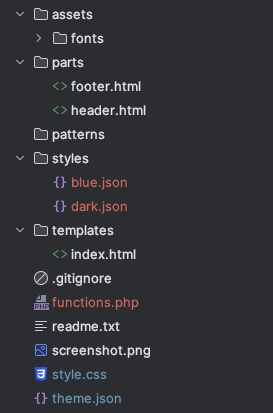
Not all of these folders and files are required but let’s break them down one by one and explain their purposes…
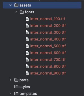
assets – a folder which is typically used to store fonts, images, CSS and JavaScript. You would usually group them into subfolders.
– fonts – a subfolder of assets, which stores local fonts that are used in the Block Theme.
parts – contains block template parts that can be managed and edited inside the Site Editor or by editing the HTML files directly. HTML file block templates are just starting points. Once you start using the UI to edit them, those edits are saved in the database and take precedence.
– footer.html – the footer template part which can be managed and edited inside the Site Editor or by editing the HTML file directly.
– header.html – the header template part which can be managed and edited inside the Site Editor or by editing the HTML file directly.
styles – this folder contains JSON files which are essentially mini theme.json files. You can use these to override the default theme.json to create different global styles. This feature allows users to switch to different colour palettes and other style variations in one click, to freshen up their site.
templates – this folder contains HTML files for templates such as index, page, archive, single etc.
– index.html – this file is necessary for WordPress to recognise that the active theme has support for the Site Editor. It must live inside a folder called templates. Please note, if you have PHP templates, you will need to use another folder for those, such as page-templates.
functions.php – used to enqueue CSS and JavaScript, plus define theme supports and other miscellaneous PHP functions.
readme.txt – an optional file to provide more information about your theme. Required if publishing on WordPress.org.
screenshot.png – this file is strongly recommended so that your theme has a thumbnail within the WordPress admin area. Also required if publishing on WordPress.org.
style.css – this is where you can define your custom CSS classes and override default WordPress styles. You can also use this file when defining custom block styles to give blocks unique looks.
theme.json – arguably one of the most powerful and important files for your Block Theme. It could be described as the heart of a Block Theme. This is where you can configure your theme’s settings, styles, templates and template parts. Not to mention define custom CSS variables and style elements such as headings and buttons. You can also define the preset styles for individual blocks too, custom and core, assuming they have a block.json.
It is really easy to add fonts to your Block Theme, especially if you are using Google fonts.
We won’t be able to do a better job at explaining this than Carolina Nymark, so you might as well head over to her lesson over at fullsiteediting.com: Theme.json typography options: Font family and size.
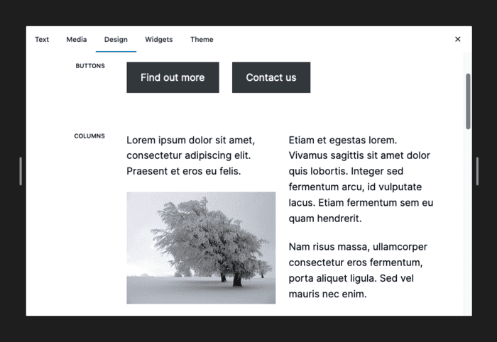
A well made Block Theme will usually provide a collection of pre-built block patterns for rapid website creation. Block Patterns are modular and reusable website components, usually made from a group of blocks working together. Patterns can be saved to the theme in the patterns directory.
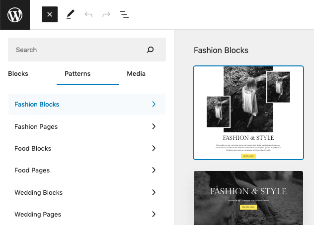
Resources on Block Patterns
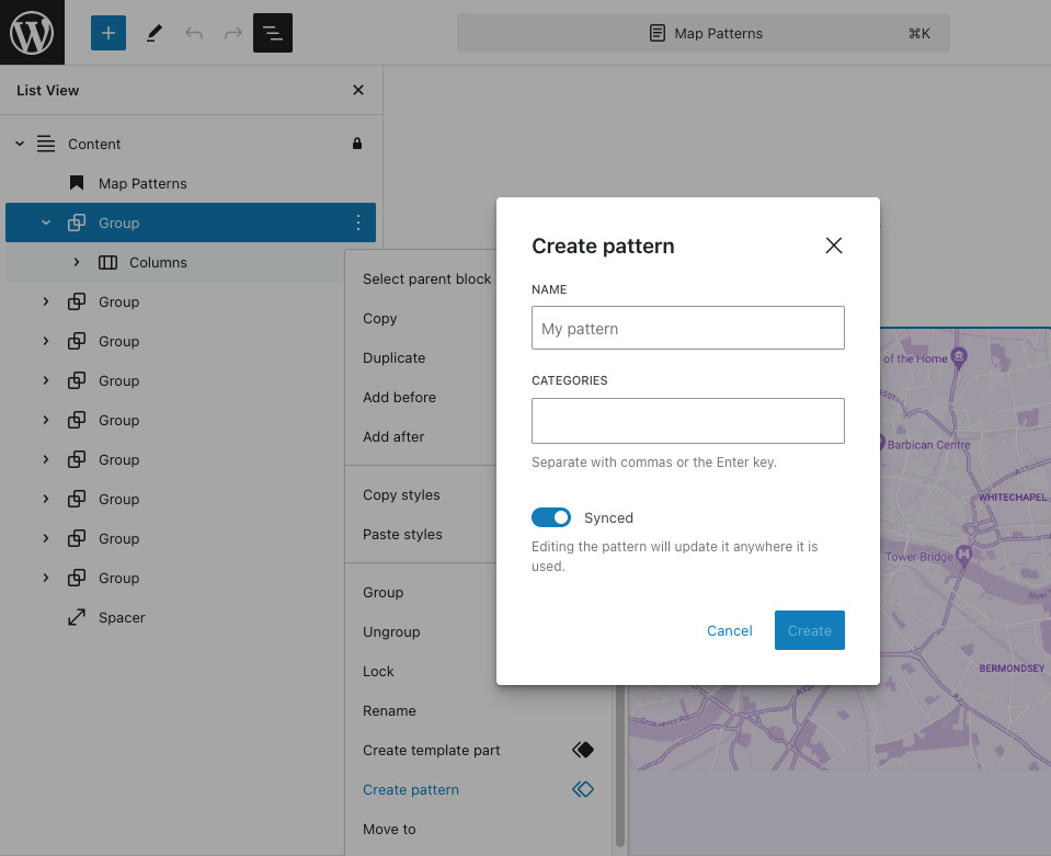
Synced Patterns empower you to store a block or a set of blocks that can be utilised later in any post or page across your website. If you frequently add identical content to a page or post, leveraging Synced Patterns will spare you valuable time and energy.
Synced Patterns can be found in the block inserter panel. To create a Synced Pattern, you can simply select multiple blocks in the list view, click the three dots and select “Create pattern”.
Resources on Synced Patterns
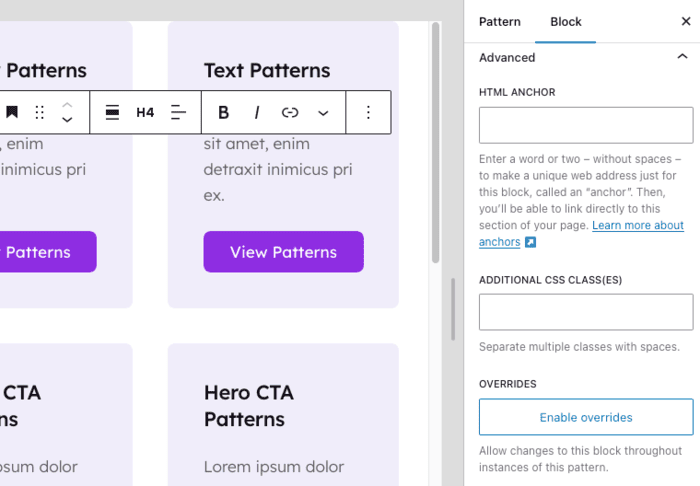
WordPress 6.6 introduces significant enhancements to the block editor with the introduction of Synced Pattern Overrides.
Synced Pattern Overrides enable users to make specific changes to instances of synced patterns without altering the original pattern across the entire site. This update addresses a common limitation where any modification to a reusable block would propagate site-wide, often leading to unintended changes. With the new overrides feature, users can now adjust individual instances of synced patterns to better suit the context or design needs of specific pages or posts while keeping the base pattern intact.
To set overrides:
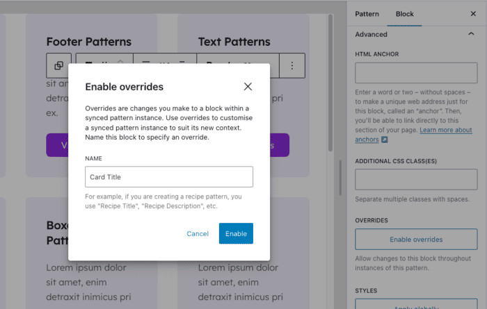
To disable a pattern override, follow the same steps and select “Disable Override”. This reverts customisations to match the original pattern.
Users can create a consistent look and feel across their site with synced patterns but still have the freedom to tailor individual sections as needed. For instance, a synced pattern used for a call-to-action block can be tweaked on a landing page to reflect a different promotional message without disrupting its use on other pages.
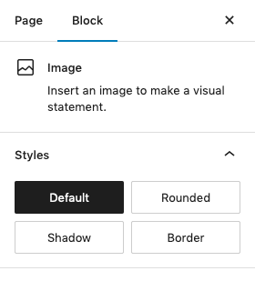
The primary purpose of custom block styles is to enhance the appearance of pre-existing blocks by adding new styles. What sets apart custom block styles from merely styling a block is that the former is readily accessible as an option within the block editor.
Custom block styles have been a part of WordPress since version 5.3, and do not necessitate the Gutenberg plugin or full site editing.
Resources on Block Styles
WordPress 6.6 enhances the block editor with new Section Styles, allowing users to apply predefined or custom styles to entire sections of content. This feature makes it easy to maintain a cohesive look throughout the site by enabling consistent styling for sections like headers, footers, or feature areas. Users can adjust backgrounds, borders, typography, and other design elements across a section, streamlining the process of creating visually unified layouts.
Section Styles are defined in theme.json, providing theme developers with a centralised way to set and manage styling options, which enhances both the design flexibility and the overall user experience. This addition simplifies the design process, allowing for quick application of complex styles without manual adjustments, further empowering users to create polished and professional websites directly within the block editor.
Resources on Section Styles
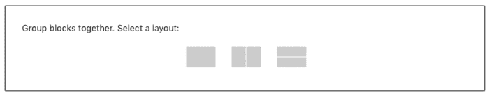
It’s common to mistake block variations for block styles as they are quite similar. While block styles allow you to modify the appearance of a block using CSS and can be chosen in the settings sidebar, block variations involve adjusting the block settings and creating a new variation with those saved settings.
The screenshot above is the group block variations: row and stack. When you add a group block to the page you get to choose which variation layout you would like:
Resources on Block Variations
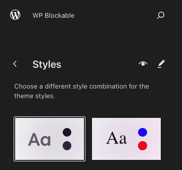
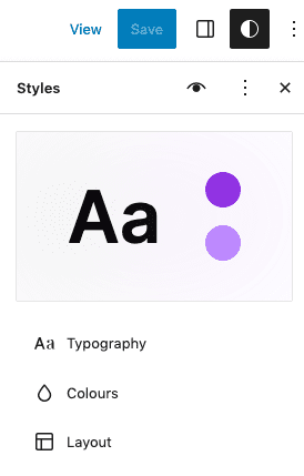
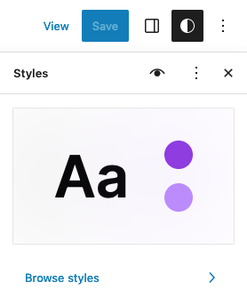
Global Styles help users change the style of their website without having to edit individual blocks or pages. It also lowers the entry barrier and makes it easier for users to style their website globally.
Resources on Global Styles
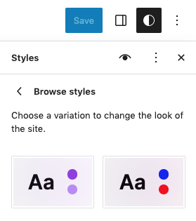
With Global Styles, developers can create a selection of different style options which can be applied in one click within the Site Editor. Typically a theme developer will create colour variations, font family variations and boxed or full-width variations.
To select a global style variation, click the global styles icon and click “Browse styles”.
Simply click on a global style variation and watch as your site transforms before your eyes.
Resources on Global Style Variations
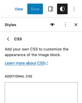
In 6.2, within the Global Styles panel, you can now apply custom CSS for global styles and per block. This is great for users who perhaps are not confident editing theme files and want a quick and easy way to override or add new CSS.
Theme developers may also prefer this way of applying CSS instead of having to edit their theme files and use FTP to push up changes to the server. Some developers however, may not like this method of adding CSS in the theme, as it may get difficult to find in the future.
Resources on Custom CSS for Global Styles
The style book is a new feature in 6.2 which allows you to see a birds eye view of your theme’s styles. A common practice by theme developers was to create a template on their website which contained all of the elements and components they used on the website so they could see everything in one place. This new feature solves this problem and saves the time of setting this up manually.
Theme.json is a configuration file in JSON format, for block settings, site-wide styles, and block styles.
In WordPress 6.6, theme.json v3 was introduced. This new version allows you to customise default font sizes and spacing.
If you have never used JSON, I recommend watching this YouTube video: Learn JSON in 10 Minutes by Web Dev Simplified.
There’s not really much point in regurgitating the same content as other amazing resources that already exist, as that’s not the purpose of this guide. With that logic in mind, we will simply point you in the direction of the resources below, which should give you all the material you need to understand theme.json inside out.
Resources for learning theme.json
Note: You’ll find some great theme.json tips in our Golden Nuggets section further on in this guide.
You might be wondering whether child themes are still relevant in this block-based era. In most cases if you’re using a parent Block Theme, there is little need to use a child theme, unless you want to make substantial changes and overrides. That being said, most things can be overridden in global styles which override the parent styles anyway. So there is less need than ever to set up a child theme.
If you want to learn more about block child themes, check out this excellent article by Carolina Nymark.
This section is a goldmine of information that will hopefully save you lots of time and confusion in your journey building block themes.
You need to include the version at the top of your theme.json file. We recommend you choose version 2 for now. Theme.json v3 is also now available from WordPress 6.6. Read up on what’s new and how it affects things before switching to v3.
{
   "version": 2
}
Within your theme.json you can define preset CSS variables and custom CSS variables. These variables can be reused within your theme.json and stylesheets. This promotes a DRY methodology which makes your theme.json easier to manage. Here’s an example of some preset and custom CSS variables in use in theme.json:
"core/post-title": {
  "typography": {
     "fontFamily": "var(--wp--preset--font-family--inter)",
     "lineHeight": "var(--wp--custom--typography--line-height--tiny)",
     "fontSize": "var(--wp--custom--typography--font-size--gigantic)"
  }
},
WordPress does a really good job at explaining this so just check out these docs quickly:
The appearanceTools setting in theme.json enables a number of settings in the editor that are disabled by default.
In v2 of theme.json, setting appearanceTools to true, enables the following settings, that are disabled by default:
We’d suggest setting this to true if you are just starting out with building Block Themes, as it will save you a headache trying to figure out how to turn on these settings individually. If you don’t need all of the settings you can simply not use them in the editor for now. Eventually once you’re more adept with theme.json, you could set this to false and be more selective about which settings are available per block.
Learn more about appearanceTools.
Taking advantage of fluid typography in Block Themes is a no-brainer. It solves many responsive challenges right out of the box and is really easy to implement.
You can simply use clamp if you want. Something like this:
"settings": {
  "typography": {
    "fontSizes": [
      {
        "name": "Large",
        "size": "clamp(2.25rem, 6vw, 3rem)",
        "slug": "large"
      }
    ]
  }
}
Alternatively you could use the new fluid type feature that was made available in 6.1. Here is how you would use this in your theme.json:
"settings": {
  "typography": {
    "fontSizes": [
      {
        "size": "2.25rem",
        "fluidSize": {
          "min": "2.25rem",
          "max": "3rem"
        },
        "slug": "large",
        "name": "Large"
      }
    ]
  }
}
Here are some great resources if you want to dig deeper into this subject:
The layout sizes specified in theme.json are what give your theme its container/wrapper sizes. WordPress currently only allows you to specify two default layout sizes, so bear this in mind when designing a Block Theme.
Here is how you can specify the layout sizes in theme.json:
{
  "settings": {
     "layout": {
        "contentSize": "720px",
        "wideSize": "1200px"
     }
  }
}
You can also define custom layout sizes in the editor when using a block that has the constrained setting. Blocks which can constrain the layout of their child blocks, are:
Here is what that looks like in the editor:
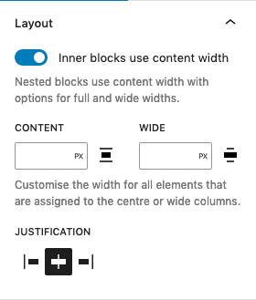
By toggling the “Inner blocks use content width” option above, you are saying that every block nested inside this block will have the default layout sizes specified in theme.json. Each child block will then have the alignment icon in the toolbar where it can be set to content width, align wide or full width.
You can also specify custom layout sizes if you want slightly more unique container sizes for that section only.
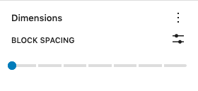
The blockGap property adjusts the vertical margin, or gap, between blocks. It is also used for the gap between inner blocks in rows, buttons, and social icons. In the editor, the control for blockGap is called Block Spacing, located in the Dimensions panel.
By default the block gap support is disabled for all themes, but you can enable it in your theme.json in two different ways:
Example (theme.json):
{
"version": 2,
  "settings": {
    "spacing": {
      "blockGap": true,
    }
  {
  "styles": {
    "spacing": {
      "blockGap": "1.5rem"
    }
  }
}
More info on blockGap:
useRootPaddingAwareAlignments is an opt-in setting in theme.json which was introduced to solve a common problem with full-width layouts.
{
  "settings": {
    "useRootPaddingAwareAlignments": true,
  }
}
The problem was that users were finding it difficult to stop content touching the edges of the screen, when inside of full-width container blocks such as groups and columns.
Users would have to manually add left and right padding to each full-width block to fix this.
Also, adding padding to the root level in the theme.json styles section (styles.spacing.padding), meant that the blocks were no longer completely full-width.
This setting in theme.json can be both helpful and not so helpful, depending on the needs of your layouts and how you like to align, nest and constrain your group blocks. It’s worth experimenting with this setting and seeing for yourself if it works for you.
For more details on useRootPaddingAwareAlignments and alternative approaches, read our in-depth article on the subject.
There’s a lot to learn when it comes to these areas. Therefore, rather than us try to cover it all, just read up on these resources in your spare time:
Custom aspect ratios can now be specified in the theme.json file from version 6.6, giving theme developers greater control over how images are displayed. This addition improves the visual consistency and overall design quality of themes.
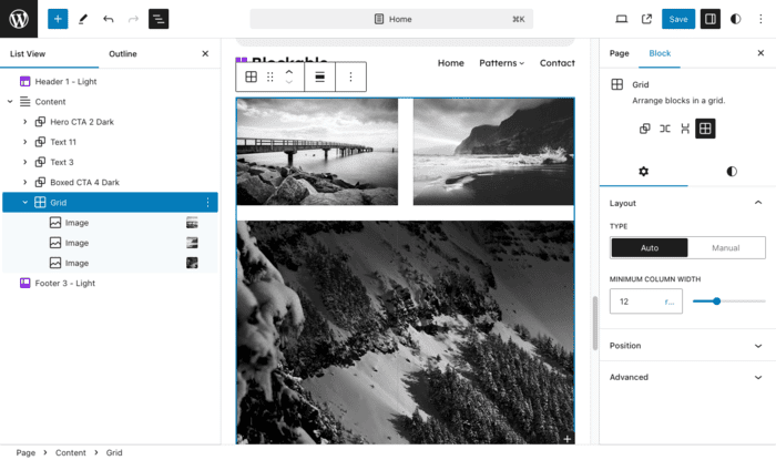
WordPress 6.6 introduces the Grid Layout feature, which significantly expands the block editor’s design capabilities by enabling users to create complex, multi-column layouts directly within the editor. This new grid block allows for easy arrangement of content into rows and columns, with options to adjust spacing, alignment, and distribution, providing a more intuitive approach to building visually dynamic pages.
The Grid Layout is highly customisable, supporting fractional units for precise control over column widths and responsive adjustments for different screen sizes, ensuring a consistent look across devices. It integrates seamlessly with other design settings, including custom CSS and theme.json, offering developers enhanced control over the site’s visual presentation. This feature aligns with WordPress’s commitment to empowering users to craft professional-quality websites with minimal effort and no coding required.
WordPress 6.6 introduces a new shortcut for grouping blocks. Ctrl + G (Windows) and ⌘ + G (Mac). This feature allows users to quickly group multiple blocks with a simple command, making it easier to manage and style sections of content collectively. This addition underscores WordPress’s focus on enhancing the block editor’s usability and accessibility for all users.
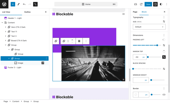
WordPress 6.6 introduces support for negative margins within the block editor, offering users more precise control over the spacing and positioning of blocks. This feature allows for creative layout adjustments by enabling content to overlap or shift beyond its typical boundaries, which can be especially useful for advanced design effects like layered visuals or offset elements. By incorporating negative margins, users and developers can achieve more dynamic and visually engaging layouts directly within WordPress, enhancing design flexibility without the need for custom CSS.
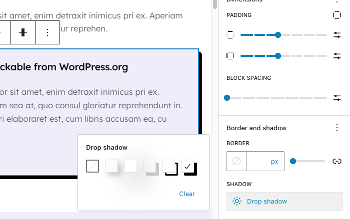
WordPress 6.6 introduced better shadow presets and the abilty to customise those presets.
There are a couple of really handy tips when it comes to styling blocks faster.
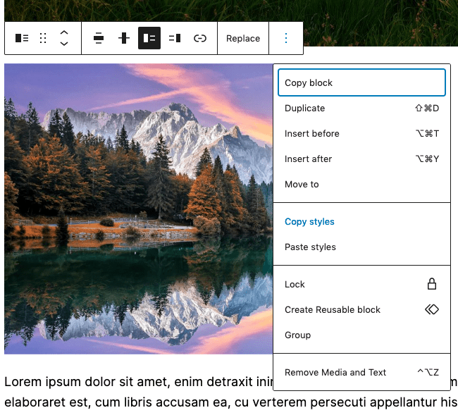
1. Copy and paste block styles
This is a new feature in 6.2. Now you can select a block, open the popup menu with the three dots, and select “Copy styles”. Then select the block you want to apply those styles to, click the three dots, and choose “Paste styles”. Simple.
2. Multi-select blocks and apply styles to all
This is another really cool time saver that you might not be aware of. You can select multiple blocks that are adjacent to each other and style them all at once. For example, say you have three paragraph blocks next to each other, you can multi-select them by holding Shift as you select them. When they are selected they will turn blue and you will be able to style them simultaneously.
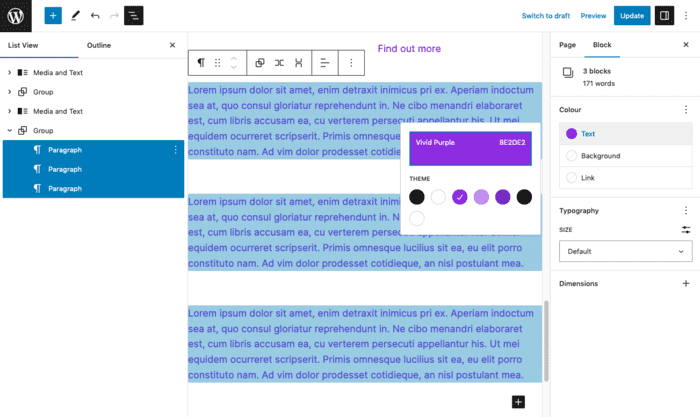
Note: this only works if the blocks are directly adjacent to each other. For example, you couldn’t select two paragraph blocks that were separated by an image block.
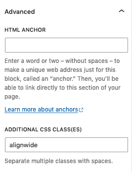
For each block, within the settings sidebar, there is an advanced tab. Inside this tab there is a field where you can add additional CSS classes. At first, using this may seem like a hack or a bad approach, and in some cases it might be. However, there are scenarios when using this is completely acceptable and sometimes the only way to achieve something.
An example and current limitation to the paragraph block, is that you cannot set it to align wide in the block toolbar. Therefore, the only way to achieve this is to add the alignwide class to the advanced tab.
So, don’t feel like you’re doing something wrong if you need to use this, however it’s recommended to only use this if the settings/styles are not available somewhere in the editor already.
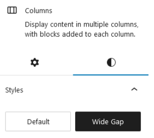
The gap/gutter between columns can be changed in either the theme.json or by using a custom block style.
This will change the default column gap everywhere on your site.
"styles": {
  "blocks": {
    "core/columns": {
      "spacing": {
        "blockGap": "4em 6% !important"
      }
    }
  }
}You can simply use the built in Block Spacing setting for the columns block to separate your columns.
This method will allow you to choose which of your columns have this style, so it won’t change all of your columns globally like the theme.json approach does.
You have to register your block style in functions.php:
# Register custom block styles
if ( function_exists( 'register_block_style' ) ) {
   register_block_style(
       'core/columns',
       array(
           'name'         => 'columns-wide-gap',
           'label'        => __( 'Wide Gap', 'textdomain' ),
           'is_default'   => false,
       )
   );
}
The above code will allow you to use the below CSS in your stylesheet. Now whenever you select the Wide Gap style in the editor, those columns will get the following CSS override:
.wp-block-columns.is-style-columns-wide-gap {
   gap: 4em 6% !important;
}
This is how our new block style option will appear in the editor:
Currently WordPress does not provide an easy way to change their default breakpoints. As discussed in this GitHub issue:
https://github.com/WordPress/gutenberg/issues/35848
However, say you want to change the default 782px breakpoint to 860px. The only way to do this currently is to override the CSS.
This CSS will do just that…
/* neutralize the wp default for 782px */
@media (min-width: 782px) {
   .wp-block-columns {
       flex-wrap: wrap !important;
   }
}
/* change the default column breakpoint to 900px */
@media (max-width: 859px) {
   .wp-block-columns:not(.is-not-stacked-on-mobile) > .wp-block-column {
       flex-basis: 100% !important;
   }
}
@media (min-width: 860px) {
   .wp-block-columns {
       flex-wrap: nowrap !important;
   }
   .wp-block-columns:not(.is-not-stacked-on-mobile) > .wp-block-column {
       flex-basis: 0;
       flex-grow: 1;
   }
}If you want a CSS class so that you can reverse the columns on mobile, add this to your stylesheet or global CSS field in the editor.
@media (max-width: 859px) {
   //Add column reverse class for mobiles
   .wp-block-columns.col-reverse-mob {
       flex-direction: column-reverse !important;
   }
}
Then you can add this class in the advanced tab for the columns block where you want to reverse the order on mobile.
Not too worry, you can override this with CSS. The below CSS code will change the breakpoint to 1024px. You can change this to any value you like.
Similarly to the columns block, the navigation block has its own defined breakpoint at which it collapses to a burger menu. Most people feel this happens way too small, at 600px. The links in your nav have usually run out of space way before that point.
/* copy of wp default css to a 1024px media query */
@media (min-width: 1024px) {
  .wp-block-navigation__responsive-container-open:not(.always-shown) {
     display: none !important;
  }
  .wp-block-navigation__responsive-container:not(.hidden-by-default):not(.is-menu-open) {
     display: block !important;
     width: 100%;
     position: relative;
     z-index: auto;
     background-color: inherit;
  }
}
/* neutralize the wp default for 600px */
@media (min-width: 600px) {
  .wp-block-navigation__responsive-container-open:not(.always-shown) {
     display: flex;
  }
  .wp-block-navigation__responsive-container:not(.hidden-by-default):not(.is-menu-open) {
     display: none;
  }
}If you want to modify a core block style variation, such as the button outline or the rounded image block style variations, you can adjust their styles in theme.json.
The best example of this is when you select the outline style for the button block, it applies its own class and padding styles:
.wp-block-button.is-style-outline > .wp-block-button__link,
.wp-block-button .wp-block-button__link.is-style-outline {
   padding: 1em 2.3em 1em 2.3em;
}
This overrides your default button’s padding styles that you’ve set in theme.json.
The good news is that you can override the core button block style variation in theme.json like this:
{
  "version": 2,
  "styles": {
    "blocks": {
      "core/button": {
        "variations": {
          "outline": {
            "spacing": {
              "padding": {
                "top": "0.5rem",
                "bottom": "0.5rem",
                "right": "2rem",
                "left": "2rem"
              }
            }
          }
        }
      }
    }
  }
}
Here are some resources which cover the topic well:
This section highlights the current limitations and gotchas which you might stumble across when building a block theme with WordPress 6.2. Hopefully by informing you of these pitfalls early on, you’ll not waste time hitting your head against the wall. We’ll also offer some workarounds if they exist.
This is a topic that has people on both sides of the fence and few straddling it. Currently the block editor does not have any responsive controls in order to adjust styles on a per breakpoint basis. Some believe fluid typography and spacing is enough, while others believe they need more granular control.
Fortunately there are plugins which provide this functionality for their own blocks, such as Kadence Blocks.
There are also plugins which add responsive controls to core blocks, such as EditorsKit.
Even so, it would be nice if core provided this functionality, even if it was optional and could be opted in with theme support.
Read our article on Making the Gutenberg Block Editor Responsive which goes into more depth about this subject.
Currently there is no way to add colour gradients to the text colour. This has to be done with CSS. This is likely quite difficult to achieve and isn’t the highest priority at the moment, but would be a great feature in the future.
Strangely the button block doesn’t currently have hover styles, which is a fairly big oversight in our opinion. Therefore, you’re stuck with using theme.json or CSS for this at the moment.
How to add hover and focus styles using theme.json:
Usually in a WordPress theme, you have some CSS at the top of the stylesheet which resets the browser’s opinionated styles.
Be aware, this approach causes issues with Block Themes, as your style.css file runs after the theme.json and the editor styles. Therefore, you start resetting your intended styles, which is obviously not ideal.
It’s now best practice to do as much of your “resetting” inside theme.json and minimise the amount of opinionated CSS in your stylesheet. Unless of course you are intentionally trying to override core styles or add custom block styles etc.
Typically in WordPress theme development, you’d define multiple menu locations and you’d assign different menus to these locations. Primary Menu and Mobile Menu might be such menu locations you would define. This made it easy to have a different menu on desktop to mobile.
With the current state of the navigation block, you can only choose one menu which displays in both the desktop view and the mobile view. This is obviously very limiting and users need a way to have more control in this area.
There is an open issue for this on Github:
https://github.com/WordPress/gutenberg/issues/38201
The search block is pretty good and has some nice layout options. However, the one layout which is currently missing and a very popular design choice, is icon-only. When clicked this would open up a modal containing the search field, or instead it would simply expand to display the search field.
There are discussions taking place to improve this but we’re not sure if this will be coming to core any time soon. It would be a great opportunity for someone to build a custom block specifically for this.
There are some open issues for this on Github:
https://github.com/WordPress/gutenberg/issues/22071
https://github.com/WordPress/gutenberg/issues/31128
https://github.com/WordPress/gutenberg/pull/31719
The Media and Text block enforces an 8% of left and right padding around the text content. This ends up being quite a bit of space. You may also not want padding on both sides.
Currently you cannot adjust this within theme.json so you have to use CSS like this:
@media (max-width: 600px) {
  .wp-block-media-text__content {
    padding: 0 !important;
  }
}
@media (min-width: 600px) {
  .wp-block-media-text.has-media-on-the-right .wp-block-media-text__content {
    padding: 0 6% 0 0;
  }
  .wp-block-media-text.has-media-on-the-left .wp-block-media-text__content {
    padding: 0 0 0 6%;
  }
}
There is an open issue for this on Github:
https://github.com/WordPress/gutenberg/issues/28556
We have scoured the internet for the best Full Site Editing and Block Theme resources we could find. We recommend checking out all of them as it will strengthen your knowledge and understanding of building Block Themes tenfold.
There are now so many videos online where you can learn how to build Block Themes. Here are some of our favourites which we recommend you watch.
You can get pretty far nowadays with Full Site Editing and core blocks. However, it’s worth knowing that you can add additional blocks and enhanced functionality with plugins.
Here are some of our favourite plugins
Kadence Blocks adds a fantastic collection of additional blocks with advanced capabilities. It also adds responsive controls to most of their blocks, which can be super handy when you need greater responsive control for something like columns.
This plugin by nick Diego is great for agencies who need to lock down certain blocks based on a variety of conditions, including but not limited to:
This is another great plugin by Nick Diego which provides a simple block for adding custom icons. Whether it be from the built in library of icons or by pasting in your own custom SVG code. Works great with Font Awesome or other icon packs.
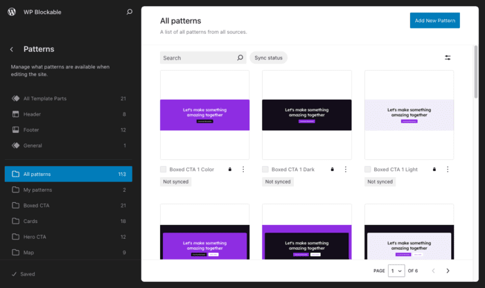
This plugin offers a nice user experience for managing your patterns and it is backed by WP Engine. An underated feature of the plugin is that it saves your patterns to your theme, rather than just being saved to the database. This is especially handy for theme developers who want to bundle their patterns in their theme for sale or releasing on the theme directory.
With Editor Plus, you can design pages faster and better than ever before. The reason this plugin stands out from the rest, is because it adds additional design and responsive controls to the core blocks.
If you want a list of plugins which provide additional blocks to Gutenberg, read this article by Theme Isle.
Woah, that was a lot of information! We hope you find this an invaluable central resource for building WordPress Block Themes.
We will try to keep this guide updated as WordPress develops. However, if you spot anything that no longer works as expected, please let us know.
Good luck and be sure to list your Block Theme on our marketplace if you’re planning on making it commercial.
29 August 2024 James Koussertari